@UniWatch nice find at work. 1980 Uniform Specification book for every team pic.twitter.com/EtPmZcvVYe
— Andrew Weatherly (@arwfsu) June 2, 2016
I have a bunch of MLB style guides from the late 1990s and early 2000s, but none from earlier than that. So when reader Andrew Weatherly recently sent me a tweet (shown above) about a 1980 MLB style guide in his possession, that definitely got my attention. I sent a reply asking him to email me privately, which he did.
During our ensuing back-and-forth, Andrew explained that his father had purchased a printing company in Oregon and that the guide had been left behind by the company’s previous owner. I asked if he’d consider selling it and he said yes, so we agreed upon a fair price and now the guide has been added to my Uni Watch library.
As you can see in his original tweet, Andrew described this as a 1980 guide. I understand why he thought that, because most of the individual style sheets carry a “10/80” notation in the lower-right corner. That means the specs were finalized in October of 1980, which in turn means that they were actually for the 1981 season, not 1980. Also, the guide was packaged in a binder with removable sheets, and the 1981 style sheets for some teams have been swapped out and replaced with updated sheets for the 1982, ’83, or ’84 seasons. So the net result is a bit of an early-1980s hodgepodge.
But it’s still an amazing document, full of invaluable information and some fascinating anomalies. I’ll do a team-by-team rundown in a minute, but first here’s some basic info on the guide:
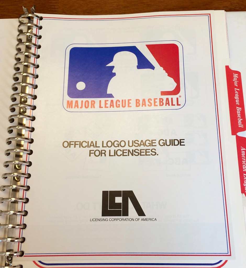
1. The guide is a packaged in a 10.5″ by 12″ binder with a batter illustration on the front and a pitcher on the back (for all of today’s photos, you can click to enlarge):


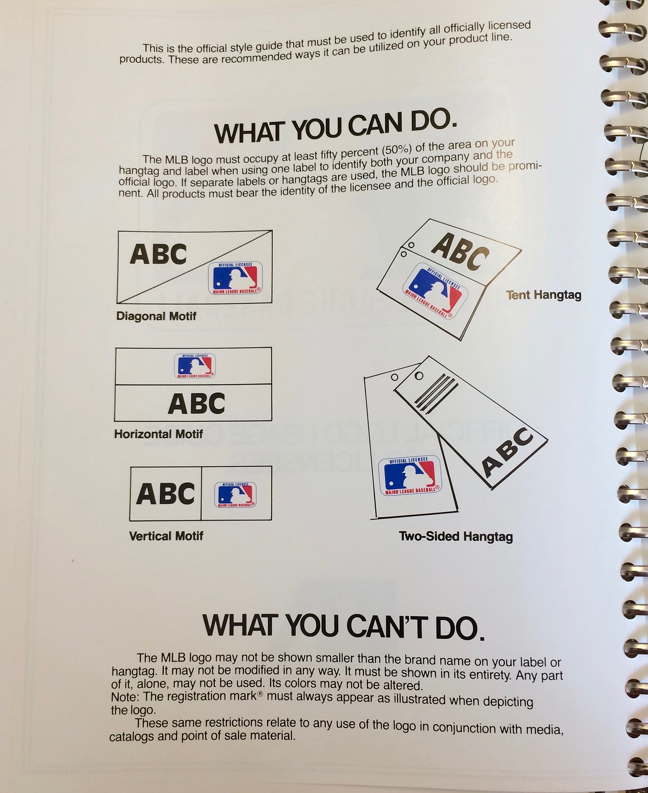
2. The guide was produced by the Licensing Corporation of America (LCA), which oversaw MLB’s licensing operations from 1966 through 1987. The guide includes some LCA paperwork, including guidelines for hangtags and a form for manufacturers to submit when they wanted to produce a licensed product. You can also see LCA’s logo, which was, ironically, pretty awful:


3. With one exception, which I’ll get to later, each MLB team is represented by two style sheets: a color sheet showing the team’s jersey, pants, cap, batting helmet, stirrups, sanitaries, and dugout jacket, along with logos and Pantone color swatches; and a black-and-white sheet showing camera-ready artwork that could be used on licensed products:
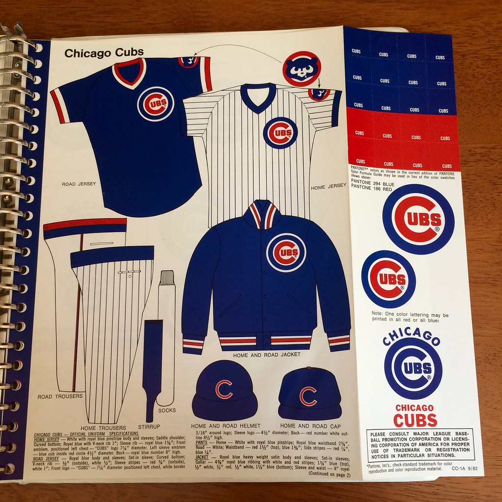

4. The bottom of each color sheet includes fine-print specs that spell out the particulars of each team’s uniform. Some of the details are really interesting. For example, check out how specific they are about how the lettering on the Yankees’ jerseys should be aligned with the buttonholes and collar:

5. If you look again at those Yankees specs, you can see that they refer to the jersey having a “saddle shoulder.” That’s the term used in the guide for raglan sleeves (except for one or two entries that do say “raglan sleeve” instead). I had never heard of the term “saddle shoulder” before, but it’s apparently a raglan variation.
6. Lots of teams were wearing elastic-waistband pants in the early 1980s. Interestingly, the guide shows some of them with two snaps and some with three — sometimes mixing and matching within the same team, as seen here with the Pirates:
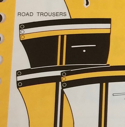
The number of snaps isn’t covered in the fine-print specs, so it’s not clear if the inconsistent snap depictions are a result of sloppy mock-ups or if they accurately depict how the pants were constructed.
7. Speaking of pants, teams wearing belts had their belt tunnels accurately depicted. In other words, the mock-up for the Tigers’ pants looks different than the one for the Mets’ pants, because the Tigers used loops instead of tunnels.
8. And speaking of belts, they’re not shown in the guide, which is surprising. Also not shown: the backs of jerseys.
Okay, that covers the preliminaries. Here’s a rundown of some noteworthy details I spotted in some of the team mock-ups:
• For the Angels, they showed the front number on the road jersey but for some reason didn’t include it on the home jersey:

• Here’s something interesting: The Astros’ mock-ups show a straight hem on the jerseys, and the fine-print description says, “Straight bottom” (all the other teams’ mock-ups show scoop-style shirttails, and the descriptions say, “Curved bottom”):

I double-checked this against Bill Henderson’s jersey guide, and sure enough, the ’Stros had straight-hemmed jerseys back around this time, and everyone else had scoop-hemmed jerseys. Just another Astros oddity. Also: Note that the white jersey is specifically designated for Sundays, something I hadn’t previously been aware of. Anyone know if they held to that protocol?
• The Athletics had so many alternates that their mock-ups spread out onto an extra color sheet. They are the only team team in the guide with that distinction:


There are some errors there. On the first sheet, it shows both of the white jerseys — button-front and pullover — with a green “A’s” logo. But Okkonen and Henderson both show that the logo was yellow. Also, the second sheet shows green sanitaries, something that to my knowledge the team has never worn.
• I showed the Blue Jays’ sheet to Chris Creamer, because he’s a big Jays fan. He said, “Woah — first time I’ve actually seen it officially acknowledged that the light blue on the cap logo is a different blue than any other logo elsewhere on the uniform (jersey/helmet/jacket)”:

• The Braves’ sheet shows a blue softball top, listed as a “secondary” home jersey, which seemed very odd to me:

I checked that against Henderson and found, as I had suspected, that it was actually a BP jersey. Not sure why they listed it as an alternate game jersey.
• For the Cubs — and only for the Cubs — the circle-R trademark logo is included on just about everything:


• For some reason, the template used for the Dodgers’ pants is different than the one used for every other team. Also: Only two teams are shown with zippered jackets (as opposed to button-front), and the Dodgers are one of them:

• The Expos’ sheet is the only one that shows a rear view of the batting helmet and cap:

• The situation with the Mets is a little tricky, so bear with me here. Okkonen and Henderson both show the 1983 Mets wearing a road blue softball top with grey script/type and orange/grey trim on the sleeves and collar. In addition, Henderson shows a home blue softball top with orange/white typography and orange/white trim on the sleeves and collar (although Henderson says it’s not clear whether this was ever worn on the field). The style guide shows yet another variation — a blue road jersey with orange/grey typography and orange/blue trim on the sleeves and collar:

You may be thinking, “The one in the style guide must be a BP jersey.” Nope — Mets BP jerseys from this period always had either orange/white or orange/grey sleeve trim. Never orange/blue. I’m pretty sure the design shown in the guide was never actually worn.
Update: Commenter Ron Sodano points out that the blue jersey shown in the style guide was actually worn in 1982, but only for that season. The style sheet is for 1983, so they apparently planned to wear it again that year but then opted not to do so.
• The Padres are the other team shown with a zippered jacket. Also, it’s interesting that the sheet has color-swatch chips for brown and yellow but not for orange:

• They were a little lazy about how they depicted the Phillies’ zippered jerseys:

• As you’d expect, the Pirates’ sheet shows their pillbox caps. But here’s the great thing: The fine-print description refers to the pillboxes as “Anson style.” That’s a reference to Cap Anson, of course — so these are Cap-style caps!


• The Rangers’ sheet nicely captures the franchise’s ongoing inability to decide whether its primary color is blue or red:

• The Reds are one of only two teams with two jackets shown, the primary version of which is definitely the coolest jacket in the whole guide:

• For the Tigers, the guide shows a primitive-looking wordmark that I have no memory of having seen before:

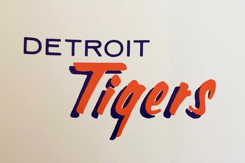
This logo isn’t shown in Chris Creamer’s database of Tigers mark, so I asked him about it. His response: “Wow, I forgot all about that one. Only other place I had seen it was on baseball cards. It was likely used through 1993, when they changed the primary.”
• For the Twins, I love that they included the little stick-figure “TC” logo on the stirrups:

• For the White Sox, instead of showing sanitaries and stirrups, the guide shows a striped red sock that, to my knowledge, the team never wore. They are also the other team with two separate jacket designs, although they’re very similar:

———
That covers all the noteworthy stuff I spotted. If you want to see the sheets for the other teams, here are the Brewers, Cardinals, Giants, Indians, Mariners, Orioles, Red Sox, Royals, and Yankees. Let me know if you spot anything notable on those sheets that I might have overlooked.
Meanwhile: I know uniform designer/historian Todd Radom has a big style guide collection, so I asked him if he has any that predate my new acquisition. He said the earliest one he has is from 1981 — same as mine. But then he added, “I have some photos of a very nascent ‘style guide’ from 1969 — just cap logos and lettering, most of them incorrectly drawn.” I asked if he’d be willing to let me share the photos here on the site, and he readily obliged:


Man, that Red Sox logo — it’s not even close! Lots of other issues, too. Standards were definitely less standardized back in the day.
(Big thanks to Todd Radom for sharing his 1969 style guide photos, and extra-special thanks to Andrew Weatherly for making this entry possible.)

Better safe than sorry: Here’s something I didn’t realize until last night: Cardinals catcher Yadier Molina is the latest player to be wearing a faceguard attachment on his batting helmet. The interesting thing is that he isn’t doing it in response to having been beaned. “Cubs broadcaster Len Kasper said [during last night’s Cards/Cubs game] that he started doing it a few weeks ago to ‘stay ahead of the game,'” explains reader Chris Howell.
That is confirmed by by this item from June 5, which includes the following:
Cardinals catcher Yadier Molina sported a faceguard on his batting helmet during all of his at-bats Saturday [June 4], saying that he had the protective addition affixed as “a precaution.” Molina ordered the piece awhile back and added that there wasn’t an incident that prompted his use of the addition, which comes down from the ear flap and covers his left cheek and jawline. He said he didn’t have any discomfort with it and intends to continue using it.
This is the first time I can recall an MLB player wearing a faceguard attachment proactively instead of reactively. (Am I forgetting anyone who’s done it before?) Imagine if it catches on — faceguards could become more the rule than the exception. Interesting.

LAST CALL for the basketball shirt: Today is the final day to order the Uni Watch T-Shirt Club’s latest limited-edition design, which is available until 11pm Eastern tonight.
As you’ll recall, we’re going one sport at a time this year, and we already covered baseball and hockey. Our latest shirt takes us to the hardcourt, as we’re launching two different basketball designs — one showing a home uniform and one showing a road uniform (click to enlarge):
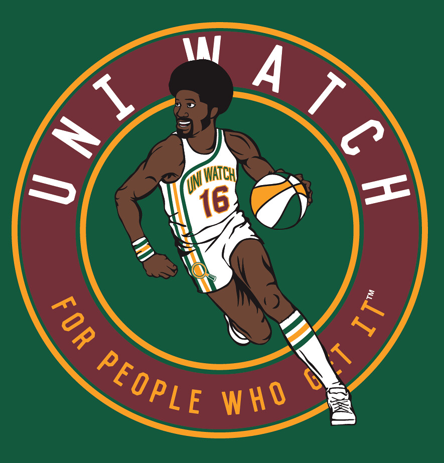
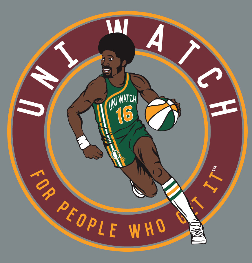
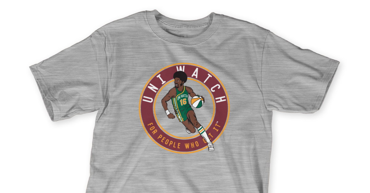
Pretty cool, right? I really love seeing that racing stripe uniform concept done up in Uni Watch colors, and ditto for the ABA-style ball.
Important: Although green and grey mock-ups are shown above, we’re offering both of these designs in four different shirt colors (green, grey, black, and white), and also in two different styles (short-sleeved and long-sleeved).
Here’s where you can order the home and road designs. You only need to purchase one of them — the home or the road — in order to maintain your 2016 “Collect ’Em All” eligibility (although you’re welcome to purchase both, obviously).
As always, big ups to my Teespring partner, Bryan Molloy, for his great work on these. I’m very happy with the way they turned out.
One more time: The home shirt is available here and the road shirt is available here. Thanks.
And speaking of the T-shirt, I said last week that I’d give a free tee to whoever came up with the best name for the player depicted on the shirt. We got tons of very good submissions, any of which would have sounded just right for a 1970s ABA player. Some of them were uni-related or Uni Watch-related, including these:
U.W. “The Aesthetic” Bloggins
Ulysses “Nightingale” Ingram [“UNI” for short]
Maxwell “Vertical” Archer
Roscoe “High Socks” Jones
Others were just, you know, ’70s-style names:
Byron “Bubble Gum” Hawkins
Curtis “Rob Roy” Holloway
Jefferson “Sugar Shack” Monroe
Jive “Don’t you dare call him Jeff” Walker
Corduroy “Collard” Green
Darryl “Swish” McGee [one of several “McGee” submissions]
Freddie “Muttonchops” Silas
I like all of these so much! I found myself wishing I could mix and match the various elements. If someone had suggested Roscoe “The Aesthetic” McGee, that definitely would have won.
No lie, I agonized over this one for longer than I’d care to admit before finally settling on our winner … Jefferson “Sugar Shack” Monroe. That one was submitted by a commenter who calls himself “the rAKe,” and he’s won himself a free shirt.
Seriously, though, any of the names listed above could have been the winner, and all of them should be considered very close runners-up. My thanks to everyone who participated.

Click to enlarge
Collector’s Corner
By Brinke Guthrie
The Bruce is loose! I don’t think any other logo says retro NFL quite like Bucco Bruce. Now, he took a lot of heat back in the day because the team was so awful (favorite quote ever, from coach John McKay, when asked about his team’s execution: “I’m in favor of it”), but everyone loves him now. I found a few terrific-looking Bruce items on eBay, including this hoodie, a long-sleeve tee, a short-sleeve tee from Champion, a very bright Cliff Engle sweater, and another tee where I swear the QB looks like No. 15 Earl Morrall.
Now for the rest of this week’s picks:
• Another Champion item: one of those Pro Line sweatshirts. Detroit Lions fans, these are very very comfortable — I had a Cowboys version. A very unique weave to these, or something. Just incredibly soft, with fleece on the inside.
• And another Cliff Engle item, this time a classic-looking 1980s Boston Celtics sweater.
• This one looks familiar (at least to me): a 1970s WHA Cincinnati Stingers hockey stick pen!
• Speaking of the WHA, check out this 1970s Winnipeg Jets warmup jacket!
• Don’t want to go all the way to Rio for the Olympics? Relive the 1984 games in this staff blazer worn at the ’84 Los Angeles Olympics.
• Will you please look at this bunch of 1970s Hallmark NFL bumper stickers. Sigh. Only the Vikes are up for auction.
• Here is one classic-looking MLB Starter jacket. This one is for the Mets, and comes with an amazin’ price tag, too. Wonder why?
• Here’s a 1970s Atlanta Falcons sticker set.
• Just bid, baby: a vintage 1970s ,Ray-duhz helmet buggy! Still in good shape for its age.
• Philadelphia Eagles bicycle hubcaps from 1969! The seller has several others to choose from, too.

Click to enlarge

A new raffle: Adidas recently came out with a new line of saturated-color baseball cleats. They will be available for sale on Aug. 1 for $100, but I have a pair to raffle off now — size 10.5, in green, like the pair shown above.
To enter, send an email with your name and shipping info to the raffle address (not to the usual Uni Watch email address, please) by 7pm Eastern on Friday. I’ll announce the winner next Monday. Good luck!
The Ticker
By Phil Hecken

Baseball News: The Syracuse Chiefs had a 2016 Father’s Day giveaway, however they used Trea Turner’s uni number from last year, and he now wears No. 7 (h/t Paul). … The Orioles will give away this Maryland flag hat on Sept. 25. Submitter Andrew Cosentino opines, “Maryland’s obsession with its state flag is 100% justified.” … And speaking of Maryland flag fetishes, the “Bowie Baysox will wrap themselves in America’s best state flag” (from Tommy Turner). … At Target Field, the Minnehaha Academy Redhawks won the Minnesota class AA high school championship wearing these red-and-gray tequila sunrise numbers (from R. Scott Rogers). Also from Scott, the photo gallery the Twins posted to Facebook shows most of the players in pajama pants, but gorgeous sock action in the picture linked above. … The MV Scrappers (a Class A affiliate of the Indians) are giving away a Bo Pelini bobblehead this Saturday (from Rust Belt Sports Talk). … People will often go to a game dressed up as ballplayers, but how often do you see a fan dressed up as an umpire?

Pro Football News: “Found a few pics on eBay of the Memphis Showboats,” says Gene Sanny. “It seems to be pretty common knowledge that in their first ever game, against the Stars, they didn’t have a center stripe. The first pic I attached is the photo most used to prove that, but there was always a bit of controversy about whether the shine on the helmet was really masking if there was a stripe or not. The 2nd pic I attached shows a locker room shot I’ve never seen before, and the helmet on the floor, as well as the helmet on the left, clearly have no center stripe running over the top.” … While Color Rash is a scourge, the author of this article is completely wrong by dissing the Broncos’ orange pants. … In a related item, defunct sporting-goods retailer Sports Authority is trying to auction its naming rights to the Broncos’ stadium — an unusual move that’s raising eyebrows in the world of sports marketing (thanks Brinke). … According to this article, the Detroit Lions almost debuted all-black Color Rash uniforms for their Thanksgiving game last year. … The subject line of this email from Eric Wright read, “lazy people who don’t pay attention to team uniform/color details really get me irritated.” He adds, “If you’re going to go to the trouble of making a Titans mailbox, do it right. Red is an accent color, not even a secondary color. An ACCENT color. Why are the #s and stripes in red/navy. So wrong on so many levels.” … An all-gold 49ers Color Rash uniform would be horrifyng (from Dave Hollingsworth, via Paul). … Now that the Cavs have ended the Cleveland major sports title-drought, the Browns jersey bearing name of every QB since ’99 is going to be retired (several, including Jimmer Vilk and Paul sent that in).

College Football News: Notes from a country concert: Ryan Robey went to “Buckeye Country Superfest” at Ohio Stadium this past weekend with his girlfriend and noticed that some of the artists (like Florida Georgia Line) were given personalized Ohio State uniforms. Later in the night Luke Bryan stopped a song to announce that the Cavs had won, then was tossed a Cavs jersey from the crowd and wore that for a little while. … Here are the jersey numbers for LSU’s incoming freshmen (from Benji King). … New collection of uniform concpets for Auburn football from Clint Richardson. … Too little too late: Adidas has finally fixed UCLA’s shoulder stripes (from Aarik Woods). Too bad, because, as Boo Radley points out, Adidas is out and Under Armour is in in 2017. … New turf design for Buffalo (from Mike Monaghan).

Hockey News: Tweeter Seb Bleu writes that the Ottawa Senators have “fixed” the XXV logo. I honestly couldn’t remember what was wrong with the original, but apparently the fans were none too pleased with the original, with some websites even holding online competitions to design a better one. … The USHL has designed a new logo (from Mark Grainda). Here is what the old logo looked like.

NBA News: Yesterday’s Ticker contained an article about the Cavs having a 16-piece jigsaw puzzle (one for each win they’d need for the NBA title), but alas, we had no pic. Reader Michael Schliefke to the rescue. He writes, “I was very curious about the Cavs’ puzzle as well, and as it turns out, a friend of mine made it in Kansas City and posted pics on Facebook. The company he works for has done tons of work for sports teams, arenas, locker rooms, etc (including making a 30′ long hot dog golf cart for the Texas Rangers).” … “Every team the Cavs beat in the playoffs had a circle enclosure for their primary logo,” notes Patrick Shaw. “What are the odds?” … There is a nice Olympic basketball uniform gallery at the Clinton Presidential Library, which you can see here (from Steve Tilders). … Also from Steve, here’s a 1984 Olympics jersey made by Descente. … Pro tennis player Roger Federer got in on the Cleveland shout-outs by wearing LeBron and Kyrie sneaker models (nice spot by Nicholas Moe). … Steph Curry is still catching grief for his “Chef Curry” kicks (from Jason Whitt). … The Cavs jersey in Nike’s “Worth The Wait” commercial has a visible patch over the Adidas logo (good spot by Mark Krugman).

Soccer News: New home uniform for Celta Vigo of the Spanish Premier League (from Josh Hinton). … Also from Josh, VfB Stuttgart (Germany) have a new alternate kit. … Those Swiss kits that ripped over the weekend? Puma is blaming faulty fabric. They have apologized. To add insult to jersey injury, Swiss player Xherdan Shaqiri joked that he hopes they don’t make condoms. (Ted Arnold submitted a similar article.) … Here are more Orlando soccer tributes from around the world (from Yellow Away Kit). … And in Orlando. … USMNT will wear their white kit tonight in their Copa America semi-final against Argentina (Yellow Away Kit again). That means we will likely see Argentina’s not-so-iconic road kit (from Colin Dilworth). … From BW, “Adidas now apparently needs not just a tournament ball & a final ball, but one for the knockout stages.”

Grab Bag: “If the guy’s name was spelled correctly, he wouldn’t have acted that way,” says Blake Pass: NASCAR driver Mike Wallace beaten, knocked unconscious; daughter also hurt ”“- NASCAR Talk from NASCAR on NBC’s Tweet. … This is pretty cool: a French golfer wore shoes with a glass of red wine on them (from Andrew Hoenig). … “I’m sure you’ll like the attached picture of a manhole cover in Minneapolis,” says Bo Baise. “Here are more.” … I grew up (basically) at Jones Beach, either on the beach itself as a kid or later at the beach for nighttime “activities” (most of which were legal), so when I saw that the Jones Beach lifeguards will be outfitted by Tommy Bahama, another small piece of my childhood died. … Camo lax uniforms for St. John’s. … This article, entitled, ““9 Events That Prove The Under Armour Curse Is Actually A Thing,” leads Garrett Heinrich to ask, “Has a brand ever been runner-up so bad?” Of course, Steph Curry did okay last year, and then there’s Auburn football. … New ultimate (Frisbee) jerseys for Egypt (from T. Atchity). … MMMMMmmm — this one is sweet: “The Flying WV cookie is legendary among students and alumni,” writes David Cline. Official campus events are often judged/rated by the presence or absence of said cookie. He continues, “Today, the WVU Libraries opened the Jerry West Collection, with lots of memorabilia from his past, and an appearance from ‘The Logo.’ And to accompany his visit — Jerry West jersey cookies! With lots of icing, it appears.” … Here’s an article about corporate names for public buildings that Ted Arnold thought may be of interest to the Uni Watch world. … That cap that John McEnroe wore, which some thought was a Mets/Yankees hybrid, is actually a Knicks cap with a patch on the side (from Eric Witt). The patch appears to be a 1998 All-Star weekend patch (from Nick Sciavo). … Netflix has a new app logo (from Brinke).


